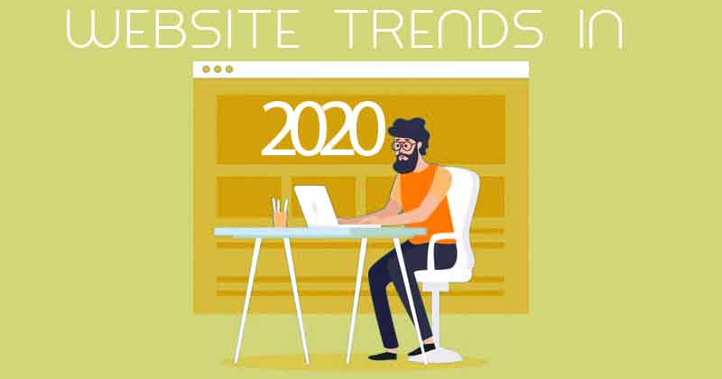
Change is inevitable and welcome and so is the change in web designing. As consumers become more mature in the way they browse and perceive the internet, web designing is evolving to meet the needs. Here are a list of trends in web designing in 2020 to watch out for, while some of them maybe suitable for you some may not be just right.
Animated Background
Animated visuals of different forms and formats have always been popular in web design. The trend continues in 2020 to use of background video/animation! Animation instead of static background brings your website to life and makes visitors stay longer — or at least long enough to watch the whole video.

Oversized Fonts and Elements
Large prominent fonts and elements communicate clearly and instantaneously. These large elements can be just about anything from large fonts, menus to oversized images or videos. They create an impact on the site visitor and help them better understand what the site is all about. They also look nice is just about any screen size.
Following this trend, more and more websites opt for a fullscreen image or video on their first fold, paired with large typography. This kind of layout leaves an impctful messgae on any visitors mind.

Split Content
You want to highlight two important messages that impact your visitor, How do you do that? The latest design trend of splitting the screen down the middle allowing each side to be in the limelight.
This technique breaks the somewhat boring rectangular mold in two. You could add contrasting colors with bold typo overlapping the two sides or could add different scroll effects on the two.
Plenty Blank Spaces
A lot of modern websites have started leaving a blank spaces between columns of text , spaces around images or page margins. Earlier it was perceived as waste of space but the new trend finds these spaces to increase legibility, highlight important design elements, separate sections, and create an overall neat and pleasing appearance.
The blank space when in harmony with visuals which are bold, large and colorful give a pristine look to the website.

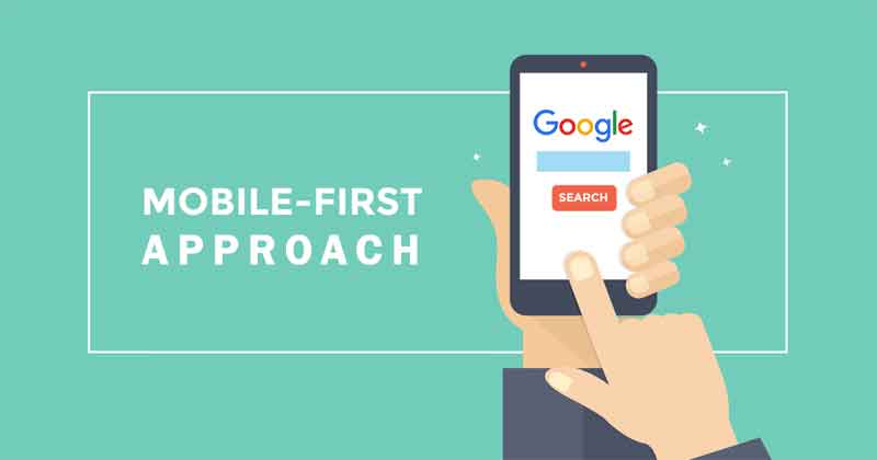
Mobile First Approach
Today more than half of the internet users use handheld devices to browse and so the next logical evolution in web design is Mobile first approach. From responsive websites to one page scrollable websites with typography optimized for different screen sizes is the new trend.